Well, I've geeked out once again and decided to try and solve the latest plateau issue the way I solve a lot of other things, by using math, data, and charts... If I can visualize it, I can better understand it.
Since October 1st my average intake for fat has gone down while my average intake of net carbs has risen. Protein has dropped off as well, but on a good note my average daily calorie intake has dropped quite a bit, almost too much according to my Dr's office when I sent this over a little while ago, but I really haven't been hungry outside of my normal eating times...
I've also been doing a lot more strenuous tasks on a daily basis, and I have seen some firming in my arms, legs, and chest area. Not muscle bound by any means, but the skin isn't as loose and even my wife has pointed it out, so some lean muscle mass may be in play as well for the plateau in my weight.
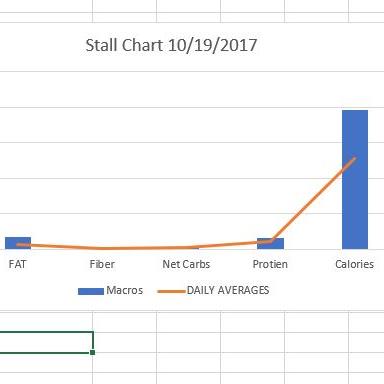
The geek out part was me putting together the chart below. Blue would be the daily averages from Aug 01 through Sept 30, 2017. The orange line is my daily intake averages for Oct 01 through yesterday. I did make changes to my macros once I hit the 300 mark, so that has also been taken into consideration.
Dunno if anyone is really interested in my stuff, but it's another tool I'll use in the journey I'm following so I can better understand how things are working for me...